|
|
|
||||
|
|||||
|
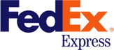
Yeah, I am talking about the 'arrow' that you can see between
the E and the x in this logo. The arrow was introduced to
underscore speed and precision, which are part of the
positioning of the company.
***************
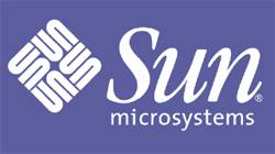
The SUN Microsystems logo is a wonderful example of symmetry and
order. It was a brilliant observation that the letters u and n
while arranged adjacent to each other look a lot like the letter
S in a perpendicular direction. Spectacular.
***************
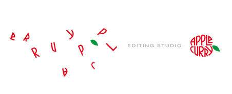
The above logo is for an editing studio. I like the way the logo
attempts to convey what they do.
***************
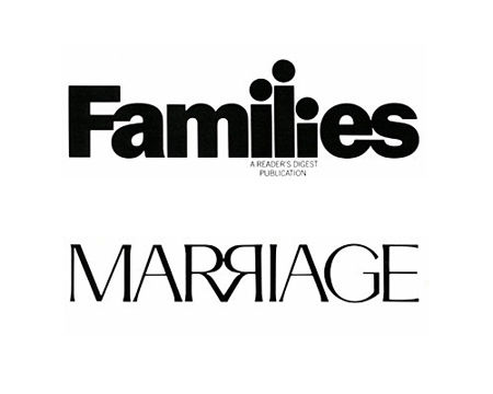
The above are two magazines from the Readers Digest stable.
Again, the attempt to communicate what it is about quite
figuratively through the logo catches my attention.
***************
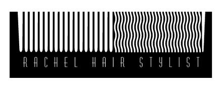
I liked this logo of a hair stylist for the cheeky humour it
brings to the (dressing) table.
***************
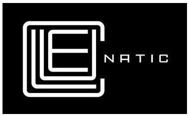
This was a logo created for a puzzle game called Cluenatic. This
game involves unraveling four clues. The logo has the letters
C, L, U and E arranged as a maze. and from a distance, the logo
looks like a key.
***************
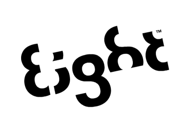
This logo is too good. For the name Eight, they have used a font
in which each letter is a minor adaptation of the number 8.
***************
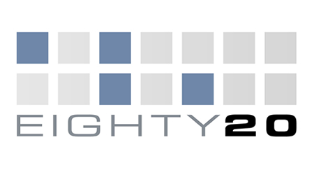
Eighty-20 is a small consulting company which does sophisticated financial modeling, as well as some solid database work. All their work is highly quantitative and relies on some serious computational power, and the logo is meant to convey it. People first guess that 20% of the squares are darkened, but that turns out to be false after counting them. The trick is to view the dark squares as 1's and the light squares as 0's. Then the top line reads 1010000 and the bottom line reads 0010100, which represent 80 and 20 in binary. Kind a like the surreal green screen of The Matrix, they want us to read stuff in binary. ***************
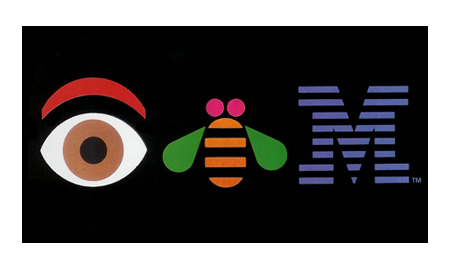
This was a logo designed in-house for some internal event at IBM.
I like that they are quite relaxed about the logo, unlike
certain other companies who do not like the logo to be tampered
with in any way even for internal promotions.
***************
*************** |
|||||
|
|
|